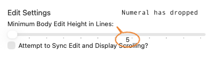
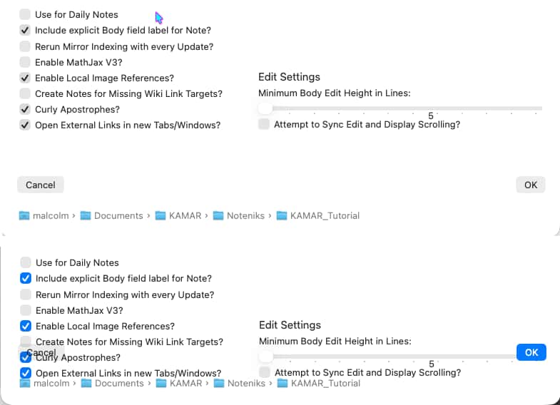
The niggle is that the settings collection dialog is able to be resized within a certain range. Oddly, that range includes making the window too small to contain all of the content. I’ve included a before and after image, showing the cancel and OK buttons overlaying other content.
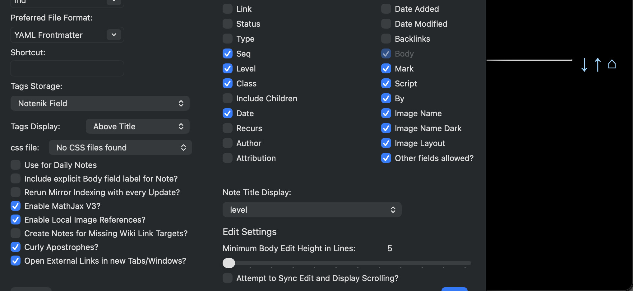
Sicne this has come up, the settings collection dialog window doesnt fit in the screen in the Larger Text (1024 x 640 resolution) display setting on a 13 inch M1 Macbook Pro. The “Cancel” and “Ok” buttons are no longer visible or accessible because they are a part of the window that extends below the screen.
This issue might have been brought up before and I don’t know if there is anything that can be done without a lot of work (multiple tabs perhaps?). My current solution is to change the resolution temporarily to 1280 x 800 and adjust the collection settings.
Unfortunately, its still a tad too large to fit vertically. The top one third of the blue “OK” button is visible but not enough to be able to click it.
Perhaps the fields can be spread across three columns?
OK, let me see what else I can do. Thanks for testing! (BTW, just to be sure you know, hitting the Return/Enter key should trigger the OK action, and hitting ESC should trigger the Cancel Action, whether the buttons are fully visible or not. This is nothing special about Notenik, but just traditional macOS behavior.)