I’ve tried to address this in the latest beta. Looking forward to feedback about this. Thanks!
1 Like
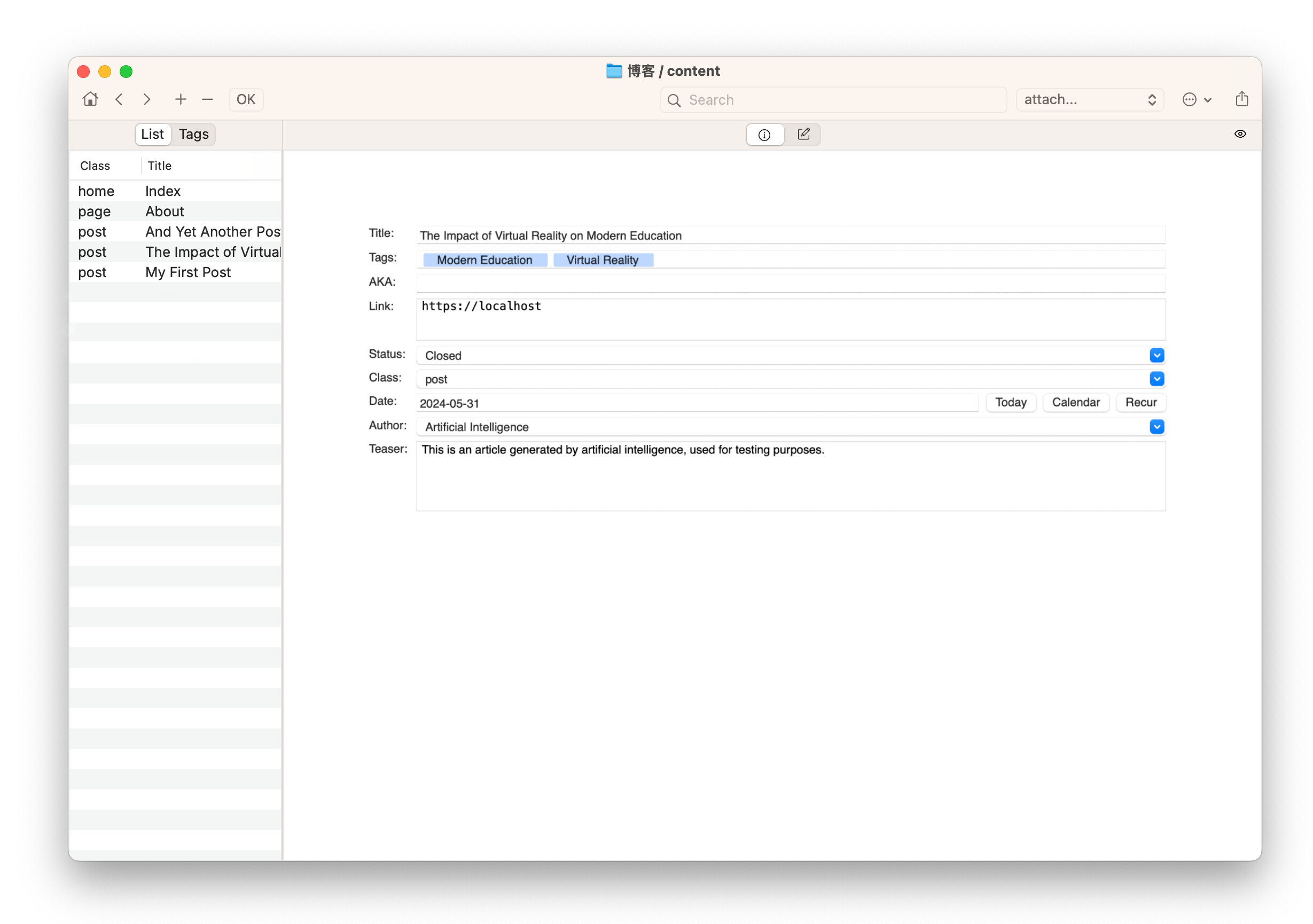
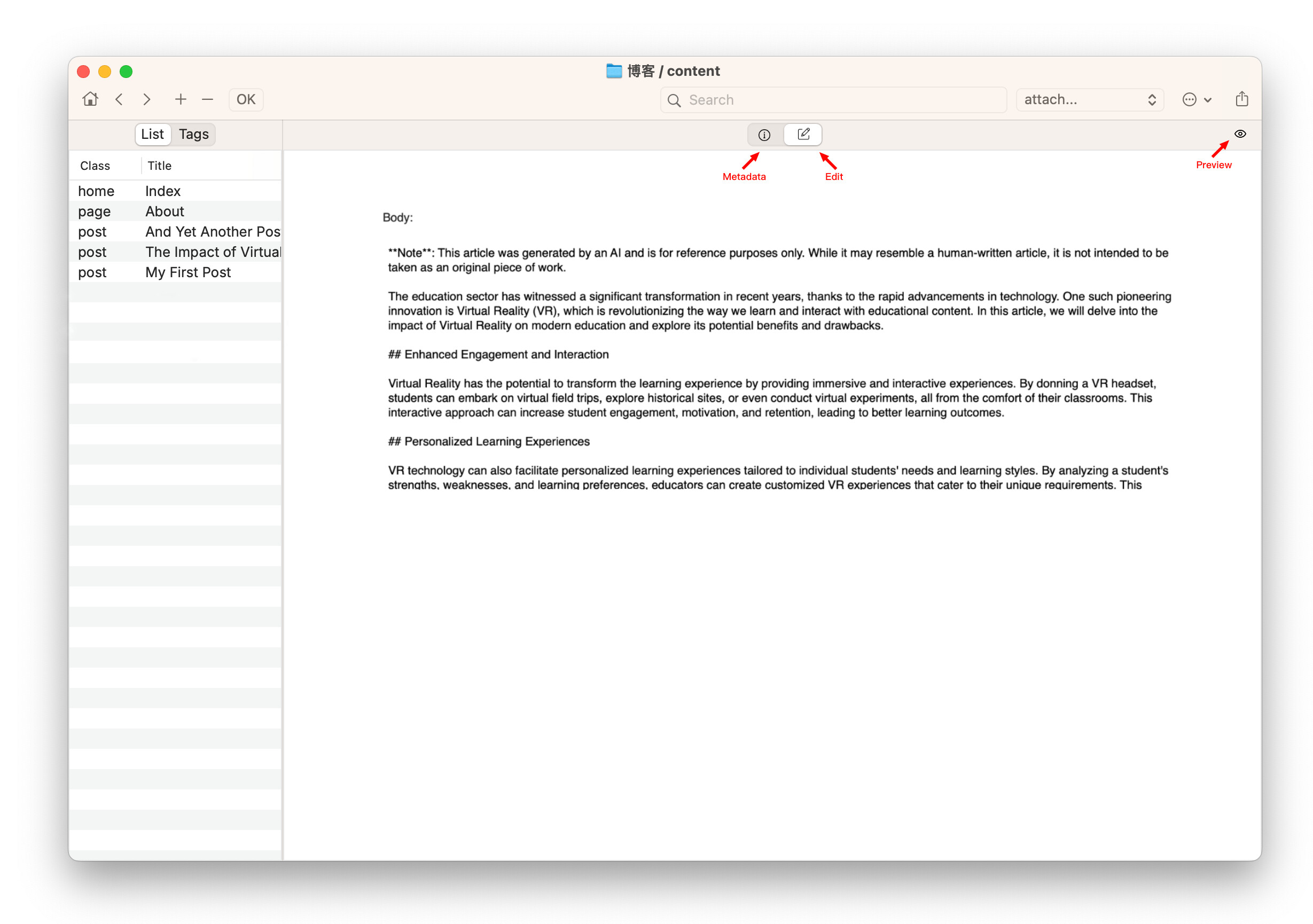
Works pretty well in my experience. The increase in the minimum Body edit height makes it possible to have the Body edit box cover a large part of the Notenik window even when there are a large number of metadata fields. This makes editing much easier. Thank you!
2 Likes
To be frank, personally I think the new design looks quite effective. The only thing that troubles me is the slightly complex usage of the two scroll bars, but it seems to be unavoidable.
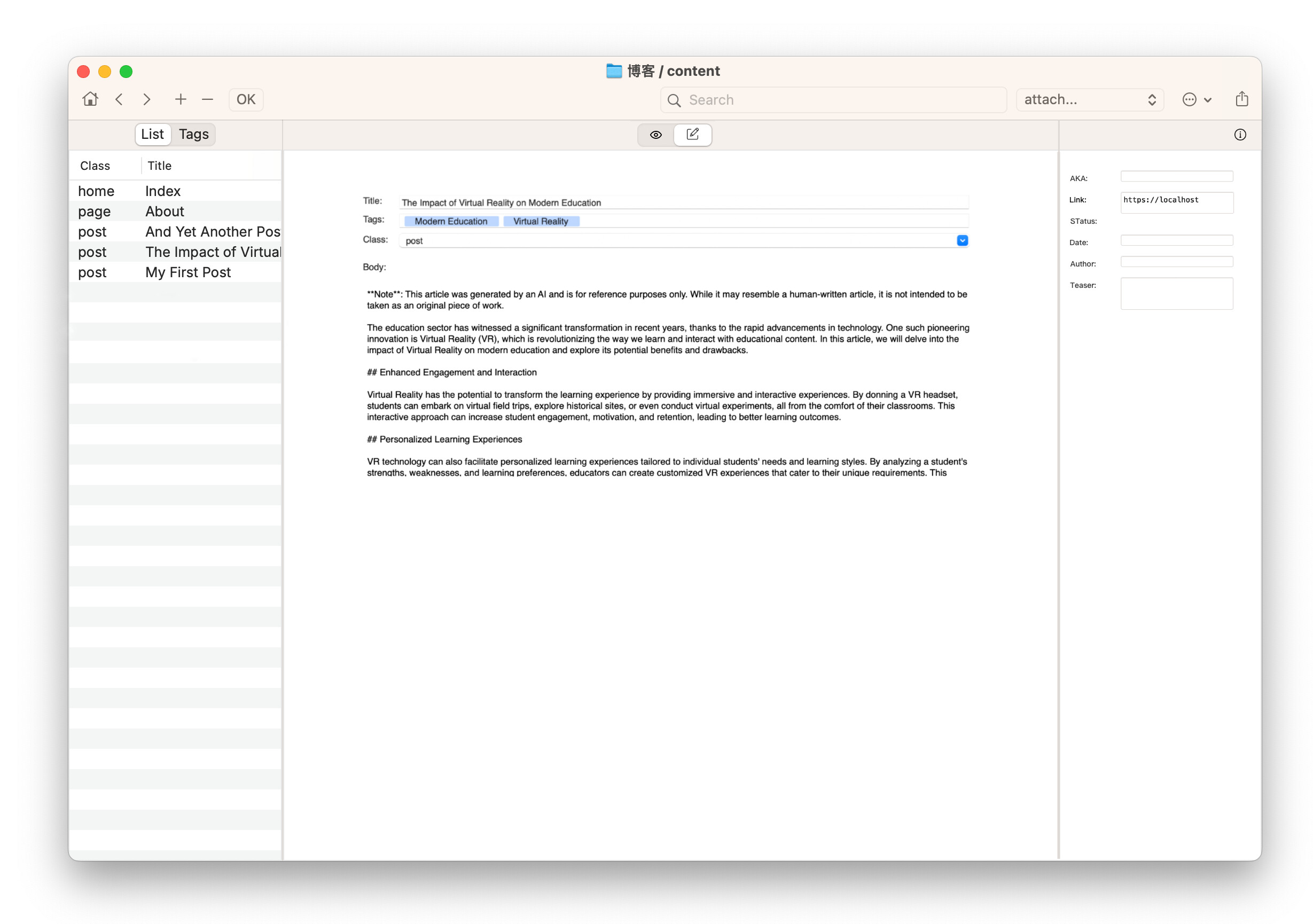
Additionally, I have some other ideas for your consideration. Although I’m not sure if they are feasible, I hope they can provide you with some inspiration. For example, what if we split the editor into two?
One for editing metadata and the other for the main content.
Metadata editing
Main editor
Or perhaps a sidebar-style interface
Yes, there are certainly other options, including the one you describe. But I have a couple of considerations here:
-
Some of these other options are technically rather complex, and would require a lot of reworking of the existing UI code.
-
I really like the fact that, despite all the Notenik enhancements that have been made over the last several years, the basic UI in which most of the work happens has remained fairly simple and straightforward. So I’m reluctant to make changes in the basic UI that would result in additional windows or tabs or panes. I’m still governed by Alan Kay’s dictum that “Simple things should be simple, complex things should be possible.”
1 Like
I think that the approach implemented in the latest beta is both intuitive and consistent with the design philosophy of Notenik. @long’s three pane mockup looks very nice., although I can only imagine what it would take for it to be implemented in code.
I don’t see any great improvement with this change i’m afraid. I would much rather see the clutter (metadata) separated and optionally hidden when editing. A sidebar approach as mocked up by @long would go much further towards me being able to use Notenik as an editing tool.
I appreciate your feedback, and can see why you would prefer an alternative editing arrangement. There is no perfect solution here that will meet everyone’s expectations. But there are a few considerations that make me want to keep the current design.
-
I like the balance of having the left side of the window (List and Tags) be roughly the same width as the right side (Display and Edit), and of the overall window size remaining the same no matter what you’re doing (editing or displaying), and of both sides remaining visible no matter what you’re doing. All of this just feels easy and right to me.
-
I like the consistency of the vertical scrolling in all four modes: List, Tags, Display and Edit.
-
It’s important to me that Notenik remain suitable for all sorts of different Collections. Some might have little or no metadata. Some might have little or no content in the Body field. The current scrolling arrangement seems to best accommodate all of this variability, without Notenik actually looking and acting like a different app for different types of Collections.
Given these design considerations (as well as technical issues), I’d like to keep the design as-is.
At the same time, I really appreciate all of the input and discussion. It’s always healthy and valuable to have a robust consideration of alternatives, even if the end result is only a renewed commitment to something that has changed very little from where we started. ![]()
1 Like